
LOVE & FAITH
Brand identity for Love & Faith.
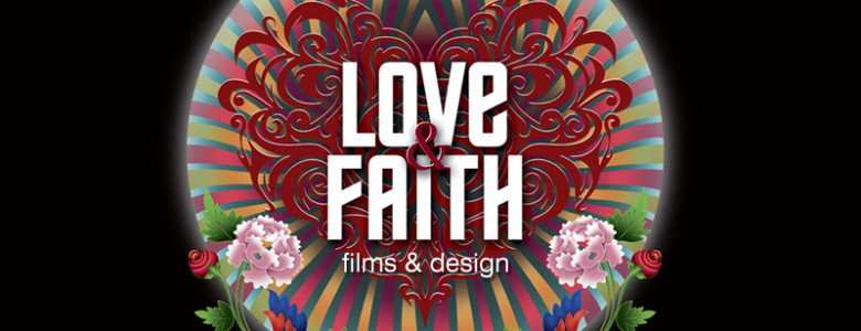
When we started our film & design company, we wanted the name & identity to reflect our core values in an honest, interesting way. We called our company “Love & Faith”, a simple yet very powerful guiding force. It’s our outlook towards the world, how we look at each other, our work and all the people who come into our lives. And eventually it’s our beacon to great, honest talent.

LOGO TYPEFACE
LOGO
The identity is inspired by the Buddhist Thangka art. (Thangka is a scroll painting with striking colors that was done with minerals & vegetable dye.) The base of the logo is a bed of flowers in a realistic rendition from which emerges the heart, in a graphic rendition, spreading Love & Faith in the universe.


OUR WORKSPACE


MOTION GRAPHICS
SPREADING LOVE & FAITH
One afternoon we got an idea and asked each one in office to write in one word what they love, and then connect it with one word about that which they have faith in. Like I love ‘art’ & i have great faith in ‘science’. Art & Science. With all the words that each one had written I made an interesting typo puzzle. (as shown below)
Everyone got excited and we created a set of office memorabilia with that puzzle. We made tees, mugs, booklets & wrapping papers which remind us daily to love and have faith in our hearts. When our clients saw this, they promptly participated and gave us words that they would like to have on their desks.
And Love & Faith started spreading…


